Campaign
One idea carried across everything it needs to appear on, so a launch reads as a launch rather than a series of unrelated posts.
- Campaign design
- Posters and print
- Ad designs
- In-store and window
jason@v2bagency.com
Social & content design
Posting every week is the easy part. Posting every week without the brand quietly falling apart is the part that needs a system.
What this is
Design you can run yourself, in the tools your team already opens, sized for the platforms you actually post on.
A designer makes twenty beautiful posts. They run out in three weeks. After that somebody on the team makes the next one in whatever app is open, using whatever font it defaults to, and within two months the feed is forty separate designs that happen to share a logo.
It is rarely a talent problem. Nobody was left anything they could reuse.
A small set of templates covering the things you post most — a new item, a price, an event, an announcement — built in Canva or Figma so your team can fill them in without opening a design file or asking us.
Tight rules make this work: two colors, one typeface, fixed positions. The constraint is what keeps week forty looking like week one.
What’s included
Scoped to what you post, not to a package. If half of this is irrelevant to you, we cut it and the price comes down.
One idea carried across everything it needs to appear on, so a launch reads as a launch rather than a series of unrelated posts.
The weekly workhorses. Editable by your team, locked where it matters so the layout survives contact with a deadline.
Short, written down, and specific enough to settle an argument. Guidelines nobody reads are guidelines nobody follows.
Related work
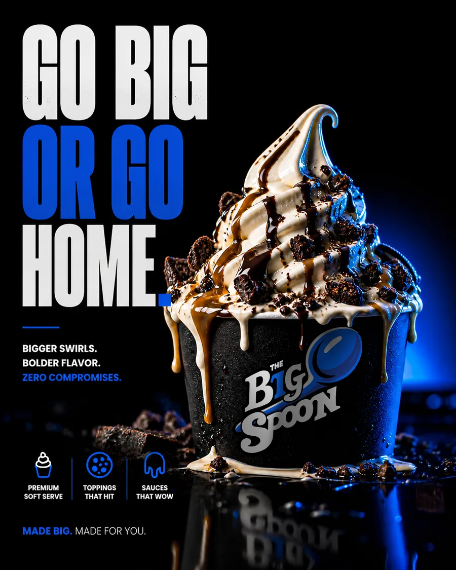
The Big Spoon lives or dies on social. Two colors, one typeface, and a set of templates the shop runs without us.
Branding · Campaign · Social
Black carries the product photos; bright blue does everything that needs to shout. Nothing else gets in, which is what keeps the feed looking like one brand instead of forty separate posts.
See the project