Design
Every page type drawn and agreed before a line of it gets built, so you are approving the real thing rather than a description of it.
- Page designs, phone and desktop
- Writing, or a rewrite of yours
- Menus, catalogs and product pages

jason@v2bagency.com
Web design
Most sites we’re sent look fine and sell badly. The work is making it obvious what you sell, what it costs, and what to do next — on a phone, in a hurry.
What this is
Every page has one job. Somebody arrived with a question, and the page either answers it or loses them. We build around that and nothing else.
The three things people actually want — what you sell, what it costs, how to reach you — are usually the three things buried furthest down. Prices sit behind a form. Hours live in a photo of a sign. The menu is a PDF that opens sideways on a phone. None of that is a taste problem, and no amount of restyling fixes it.
The other half is speed. A site that takes six seconds to paint on a phone has already lost most of the people who tapped it, whatever it looks like when it finally arrives.
We start with what a customer is trying to do and work backwards to the layout. Prices go in the open. The thing you sell gets put first, with room to do the selling. Anything that exists to look busy comes out.
Then it gets built to load fast on a mid-range phone on a bad connection, because that is the machine most of your customers are holding.
What’s included
One fixed price, agreed before anything starts. It covers the whole list below unless we say otherwise in writing.
Every page type drawn and agreed before a line of it gets built, so you are approving the real thing rather than a description of it.
Webflow or WordPress for most clients, custom when a project genuinely needs it. Your account, your domain, your content.
Handover is a real step, not an email with a password in it. You leave able to change a price yourself.
Related work
Triple J had sixty items, three delivery apps and a phone that rang all morning with questions the site should have answered.
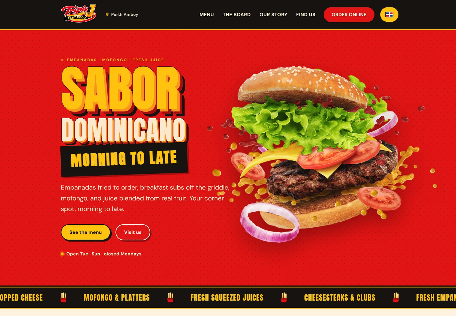
Website · Menu system
We rebuilt the site around how people actually order: a menu you can scroll with prices in the open, and the three questions people used to phone about moved to the top of every page.
See the project